Monday, December 26, 2016

Happy Hanukkah Card

Hanukkah began on the evening of December 24 this year. I decided to make my boss a Hanukkah card. He is always so gracious each year, wishing all the staff happy holidays and Merry Christmas and I have felt bad for not stepping out of my comfort zone to make a card for him. So I set out on a Google quest for inspiration and education. Who knew the number of candles on a menorah can vary?

I finally found a free SVG file (https://cutfiles.net/444/menorah-2-cut-file/) that I could cut on my Silhouette Cameo, and with selective masking, I was able to glitter up a burnished velvet menorah. I used yellow and gold glitters to create the flames. It is so pretty in real like, sparkling against the white cardstock. It seems blue and gold are traditional colours, but I think the menorah design is modern, clean and simple. Then again, what do I know? Happy Hanukkah!


I am entering this in the CAS-ual Fridays challenge:


Sunday, November 6, 2016

Gold Star Christmas

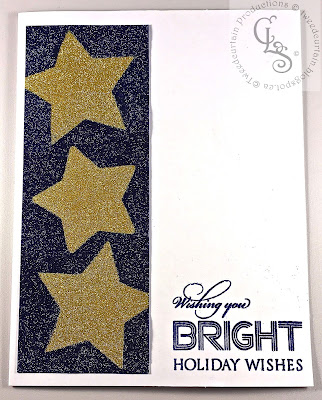
I am slowly working my way through Sylvia Durocher's monthly Christmas card prompts. I am not doing them in order, so today I will share the prompt from January 2016 - which was to use the colour gold and a 5 or 6 pointed star. I use the Burnished Velvet technique to create my three stars. I used the 52 Christmas Card Throwdown challenge November Sketch for my format.


Using two colours of microfine glitter and wide double sided tape, I created the panel of gold stars against a navy sky. The navy is not so speckled in real life but the camera was picking up the reflection from the glitter. The sentiment is from Penny Black's Festive Cheer set. I am entering this in the Penny Black and More Anything Christmas challenge.


House on a Hill


Over at the Shopping Our Stash Challenge Blog, they are celebrating home sweet home, looking for projects that feature one or more houses. I recently pulled out a lot of Christmas stamps in my stash that I have not used, feeling guilty they have been neglected. This Cottage House stamp by Pink Persimmon is a few years old and has not seen any love, so the challenge was perfect for this.


In the background is a Rubber Stamp Avenue "Joy to the World" stamp, one of the first stamps I bought way back when. The sentiment is from Waltzingmouse Stamps and is heat embossed in gold, which makes it a little hard to read. It says "The happiest of holidays is a Christmas spent at home."

SaveSave

Purple and Pink for Christmas


How are you coming on making Christmas cards? I have not had much time or energy for it this year, unfortunately. Hope to get some more made today. Here is one I recently made:


Purple and pink seemed a little out of the norm, but these Gina K Designs ornaments are quite regal looking, so I thought it would work. Just a few pearls and a rhinestone to embellish. The purple cardstock is pearlized, so it adds a bit of shimmer, too.

Am entering this in Addicted to Stamps and More 
Challenge #218 - Holidays.

Thursday, November 3, 2016

Penny Black Berry Kissed


I recently picked up a few new stamps from my local stamp store, Stampers!, which is sadly closing shop at the end of this year. They are Penny Black stamps and they have sort of a watercoloured feel to them already. I am watercolour challenged so I figured this would be a good way to try and get the look. This bunch of leaves and berries is called Berry Kissed.

Using my MISTI stamp positioner, I coloured the leaves, stems and berries using Distress markers. I just kept colouring and stamping until I got a look I liked. I clear embossed over all, then used an embossing pen to add glitter embossing powder to highlight parts here and there. I spattered the watercolour cardstock with Distress Shaded Lilac ink and used the same to colour the base of the card. The Penny Black sentiment (Festive Cheer) was stamped in VersaMagic Perfect Plumeria and clear embossed. I found a bit of plumeria coloured cardstock to layer underneath. 

I found a challenge on the internet to enter for Penny Black stamping - the Penny Black Saturday Challenge. The current call is for autumn colours and I think I achieved that.

I am also entering this in the current Christmas Card Challenge. Thanks for visiting. 


Friday, October 28, 2016

A Basket of Pumpkins

Here's a CAS card for the Card Concept Challenge #60 (Chevron Pumpkin). I got the fall vibe and the pumpkin part. 


Stamped with Memento ink and coloured with Copics. The pre-fab card is by Memory Box - quite a sunny yellow. I love their coloured cards because they are white on the inside - no need for a liner. Thanks for stopping in!

Sunday, October 23, 2016

Mojo Monday 470


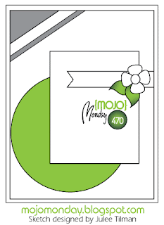
The Mojo Monday 470 sketch challenge is about to close and here I am screeching in at the last minute. Here's the sketch.


Here's my new baby card:


Both the pram (Pink Persimmon)  and the sassy sentiment (Waltzingmouse Stamps) are retired stamps. The vintage button strip is from Lost Coast Designs. Thanks for visiting!


Sunday, October 16, 2016

Starting Christmas Cards

I should have been making cards all year long to have ready for Christmas, but I didn't. So now it's time to get cracking. Thankfully I have a MISTI stamp positioner to make it go a little quicker. I chose the month of April in Sylvia's Christmas card challenge on her blog: green and foliage.


I made six of these cards this afternoon. I tried many different products to make the snow effect. The card above has Liquid Applique that I sprinkled with glitter and heated to puff up. Others got Enamel Accents, dries white glue with glitter, Stickles, etc. I snapped a photo while they were drying. Jury is still out on which is my fave.
I tried a few different inks for the woodgrain background. The front right card was made with a woodgrain embossing folder, the rest were scored and inked.

Stamps from Gina K Designs (Festive Foliage and Noel). I will enter this in the Christmas Card Challenges #45.


Sunday, October 2, 2016

More Carved Wood Panelling


Earlier today I posted a card with a new-to-me technique of creating carved wood panelling as a background. It was actually the second card I made. Here is the first. 


All the stamps are Gina K Designs stamps. The frame label is from a retired GKD set, but the roses and sentiment are from Old Country Roses, a current offering. If it looks familiar, it's because it was designed by Claire Brennan, formerly of Waltzingmouse Stamps, who is now designing for Gina K. Claire is designing new sets and also re-issuing some of her old WMS stamps under the new label. So if you missed out before, this is good news!

Kat at Kat Scrappiness says we can enter her contest more than once so I am throwing this one in the ring, too. 

Carved Wood and Espresso

Yesterday was World Card Making Day and I was mostly battling a head cold but I did find some energy to try a new technique from Gina K at StampTV. She has a great video showing how to make a carved wood type of panelling for a background.

I made this card:
Stamps from Gina K Designs.

I am entering this card in the Kat's Scrappiness Blog contest that has no restrictions. There are prizes. Gina K is one of the lovely sponsors. You should enter, too!

Friday, August 26, 2016

Birthday Buddies

Here's a birthday card for my hubby. I used the Lawn Fawn Party Animals set I purchased on vacation in California this spring.

Dies- Grassy hills: Lawn Fawn; Marshmallow Clouds: Memory Box
So cute! I am entering this card over at

Seize the Birthday! They have an optional "toppings" to use tags and while I did not do so with this card, I hope to come back and add another later. Their design team has some great samples that have inspired me!


Sunday, July 31, 2016

A Vintage 50th Birthday Card and Gift


Quite some time ago I purchased the 12X12 pad of graphic45's Botanical Tea Collection and I am going to be sad when it is all gone. I needed a special birthday card for a colleague who likes vintage things, and adores gardening, so this was my go to stack.


I dusted off my Tim Holtz caged bird die and used some Creative Chemistry techniques to give the bird's home a patina. The flowers were made using the Spellbinders Bitty blossoms dies. I had to make a box to go with.
Sentiment: Waltzingmouse Stamps
I added Rock Candy Dry Glitter to the dollar store flower. I used Distress Crackle Paint and inks and stains on the papier mache box. I made some wrinkled rayon ribbon with Distress Stains. The label frame was silver, but I antiqued it to match the really old key using alcohol inks. I forgot to take a photo of the inside, but I lined the box with the same background paper as on the card. Here's the set:

I am entering this in the Seize the Birthday challenge.


Saturday, July 23, 2016

Summer of Creativity Week 7

Alcohol Inks were the challenge for this week of Tim Holtz's recap of Creative Chemistry 102. It has been fun to revisit some techniques.

My favourite Alcohol Ink technique is to use it on clear acetate, and then apply clear double-sided tape and foil the back. If you click on the photo below you might be able to see how the acetate glows like jewels. I used silver foil.

The Alcohol Inks I used were Cranberry, Wild Plum and Denim. I cut out a Sizzix scalloped tag die cut from acetate and used Tim Holtz's On the Edge Brackets die to create the top and bottom borders from acetate. Steel rule dies like these are best for cutting acetate. I embossed the top border with a Sizzix checkerboard embossing folder.
The card background was created by second-generation stamping the Direction of Your Dreams (Time2Fly/Uptown) in Iris StazOn over the white card front, then sponging Wilted Violet Distress Ink through the Bubble stencil.

The dragonfly is from A Stamp In the Hand and I stamped it on the front of the tag with StazOn Cotton White. A brad and some gem stones finished it off. This will make a nice graduation card for someone.


Summer of Creativity Week 6

Where does time go? I am posting my efforts for week 6 of the Tim Holtz Summer of Creativity over at onlinecardclasses.com.

For week 6 we were to use two stencil techniques. I used three four Tim Holtz stencils for my project and started with a white Strathmore 110 pound Mixed Media base.

I used stains to wash the background, then pounced Broken China Distress Paint about. I sponged Wilted Violet Distress Ink through the Doily (left) and Gothic (right) stencils and then inked the burlap stencil and used it as a monoprint device here and there. Then I sponged Distress Paint in Tarnished Brass through a Bubble stencil (not shown).

I used Distress Embossing Ink to stamp the Lost Coast angel and heat embossed in black. I did the same with the column that I had hand-carved many years ago. I added bits of music (Waltzingmouse Stamps) in black Archival Ink here and there.

Finally I added some Nuvo Crystal Drops (White Blizzard) to the wings to add some iridescence which the camera refuses to pick up!


Wednesday, July 6, 2016

Summer of Creativity Week 5


This week's Online Card Classes lessons and challenge from Tim Holtz were all about Distress Paint. I only own a small handful of colours so it was especially challenging. I tried a few techniques using these paints to create a birthday card.


The main image was done using the Stamping Resist Technique: the butterfly was stamped with Chipped Sapphire Distress Paint onto white cardstock and allowed to dry, then I sponged overtop with various Distress Inks. I created a background by embossing silver foil and used the Industrial Technique to antique it. I did not have Black Soot so used the same blue paint. I used the Altered Surface Technique on the Compass Coin by dabbing Broken China and Chipped Sapphire Distress Paints on and selectively wiping off.

The sentiment is a Tim Holtz stamp and I used the same Distress Paint to stamp it. I think it works for a birthday card for a gentleman even though there is a butterfly on it. Thanks for stopping by today.


Sunday, June 26, 2016

Inspiration Challenge


Yesterday's Splitcoaststampers.com's Inspiration Challenge was to visit a board on Pinterest called Crafts - Tim Holtz and choose something that sparked our imagination. I chose this card. My take was a lot brighter, and I decided to skip the bead embellishments as the colour seemed enough busyness.

I did not have the wildflower die so I cut something on my Silhouette Cameo with a similar vibe, then applied Distress Inks while it was still intact on the mat.

It's a great Pinterest Board - I encourage you to check it out.


Saturday, June 25, 2016

Summer of Creativity Week 4

It's week four and our challenge was to use Archival Ink. I chose the Archival Ink resist technique.

I only have a few Archival Ink Pads: Black, Sepia, Maroon and Banana. The technique calls for light coloured ink, so I stamped the background butterflies and the polka dots in Banana.

It is interesting to me how the same Banana ink looks orange-gold when the Wilted Violet Distress Ink was sponged over top, and bright yellow when the Mowed Lawn Distress Ink was sponged over top. Both were stamped on the same glossy paper.

I stamped a Stampington collage butterfly and heat embossed, then added a die-cut butterfly that was also a resist on glossy using a script stamp. Thanks for looking!

Sunday, June 19, 2016

Summer of Creativity Week 3

Here it is - week 3 in the re-cap of Creative Chemistry 101 lessons. I believe it was 2012 when I first did these lessons and the nice thing about revisiting them now is I have new supplies and more colours to work with.

I created the tags below as a warm up, but my goal is to make a card for each re-cap challenge, so I did that, too.

For the shell tag I used the Perfect Distress technique but did not seem to get as much bleeding action as I would have liked. For the palm tree I used a combo of Perfect Distress Mist and Splatter. I stamped the palm tree with white pigment ink, heat set it, then overstamped with brown and green Distress Inks. 

My finished card is made with the Perfect Distress Splatter technique. I think this will make a nice card for a man. The camera refuses to pick up the pearly sheen on the card. Trust me, it's there!