Showing posts with label Perfect Layers. Show all posts

Sunday, November 16, 2014

Flowers for WMS Fanatics Challenge


The Waltzingmouse Stamps Fanatics Challenge is Flowers. There's almost two weeks to play, and the theme is broad, so I hope folks will join in. They can even be Christmas blooms, like poinsettias or chrysanthemums.

I made this card to pop into the post for someone very special. I don't know if I am the only one, but it seems the more a card means to me, the hardest it is to get "just right!" I stamped and heat embossed flowers and leaves in clear on white cardstock, then went around the leaves with green Distress Inks and around the flowers with orange and yellow Distress Inks. Wiped the excess off to bring back the shine of the embossing.

The "miss you" is an electronic cut file that was cut out of the cardstock on my Silhouette Cameo. I cut a few, glued and stacked them together, then added black glitter to the final layer and nestled it back in the words-shaped hole. It is securely embedded, but also raised up a bit due to the layers and the glitter. Neat effect. I echoed the black with a very narrow border of black cardstock cut with my Perfect Layers tool and affixed to an olive card. And here it is upright:
Hope you'll play along, too! Thanks for stopping by.


Monday, May 12, 2014

WFC Colour Challenge and Faux Enamel Dots

Look at these fun tropical colours the Waltzingmouse Fanatics chose for us this fortnight! Love those little birdies. 
Here's my card, featuring Nordic Spring and Big Day - Today stamps from Waltzingmouse Stamps:

The really fun part of this card, besides the RIOT of colour, is the  faux enamel dots technique. They have been popping up all over, but I have not seen any in my local stores. Lindsay, the Frugal Crafter, to the rescue. Her video on her blog shows how to make these fake-aroos out of paper and embossing powder (two things we all have on hand). The neat thing with this technique is your dots will always perfectly match your paper.
 
I am needing a lot of birthday cards all of a sudden, so this is also being entered in the current Seize the Birthday challenge which asks for flowers (note the tulip border). Thanks for stopping by. Let me know if you try this technique.


Monday, May 5, 2014

Pretty Bird

Tweet! Here's a Happy Mother's Day card. My mom likes birds quite a bit so I guess that was the inspiration for this card, along with a Canadian Stamp Talk Challenge to use sequins.

The sentiment is a Quietfire Design stamp. The paint splotches are stamps from Waltzingmouse Stamps. The sequins are not your run-of-the-mill hexagons. These are round with concentric circles and I have had them for 10 years or more. I added a few gemstones to compliment. Shading is Broken China Distress Ink. The bird is a Marianne die popped up on foam tape.

I was going for Clean and Simple, but I just cannot help myself! I am sharing this for the Mother's Day challenges at:
http://thepinkelephantchallenge.blogspot.ca
and
http://cutitupchallenges.blogspot.ca

Sunday, April 14, 2013

WMS Christmas Card Challenge


A quick catch up post on my neglected blog. The monthly Christmas Card Challenge at Waltzingmouse is in full swing (see link at right). For April, Linda Suarez challenged us to use a non-Christmas WMS stamp in our card. Other than the sentiment, all the stamps I used are non-Christmas, from the Sewing Box - Hugs set

In March, the task was to use the colours of navy and a "zesty citrus green," thanks to Cassie J. You might want to put on sunglasses before scrolling further!


I used the wreath from the Around Christmastime set, the border from Nordic Winter and the Noel from Compliments of the Season Two. WMS stamps are fun to mix and match! It is hard to capture in a photograph, but I added diamond stickles to the wreaths and borders.

I am slowly working on the Christmas 2013 card stash. Thanks for visiting!

Sunday, October 28, 2012

Sew Thankful for Friends


My dear friend Mary lives in California, but on a recent trip to visit here, she gave me my early birthday and Christmas presents. We are great ones for avoiding paying shipping costs! She presented me with a Hero Arts stamp called "Make it Yourself" and I promptly told her I would use it to create a thank you card for her.
I paired the stamped and Copic coloured image with October Afternoon Thrift Shop paper (a favourite paper pad that is sadly dwindling...) and used Antique Linen Distress Ink to age the edges. I used the Perfect Layers tool to mat the image. The small label was punched with a Stampin' Up! punch, stamped with a Waltzingmouse Sentiment and red brads echo the dress and border. 

I usually don't do much to the inside of my cards, but this Artful Stamper sentiment seemed just right! Thanks for peeking in!


Thursday, October 18, 2012

A Tale of Two Cards


You might be surprised to know that many of the cards that I have shared here on my blog are not the final products. Often I will snap some photos and write a blog post, but then when I go to mail the card or attach it to a gift, I see it with fresh eyes and decide to edit or enhance it. I might add a bow or gemstones. Not drastic changes, but just something more that I feel the card needs. I don't know if I am the only one who does that.

This card (above) is an example of that. This is how it looked when I first thought it was done. Now before I tell you more - let me fully disclose the wonderful inspiration for this card. It was not an original idea - I fell in love with Waltzingmouse design team member Julia Aston's card here and when I finally got around to ordering the Half Pint Heroines set from Waltzingmouse Stamps, I knew I wanted to CASE Julia's lovely design. I already had a similar Memory Box die to make a "village" bottom border. I cut it out of white cardstock and added a bit of colour behind the window and door openings. I was also taken with the sky Julia sponged onto her background, and I definitely need to work on that technique, but I am glad I tried it.
Julia paper-pieced her balloon and added gemstones, and I thought those were grand ideas, too! (I am shameless.)
Now you will see that after I took those photos, I monkeyed around a bit with the landscape. The white seemed too pale with all the colour up top. I felt it needed a bit more punch. So I started adding colour with Copics. And Miss Sunshine in the basket looks like she flew too close to the sun - an attempt to add just a touch of blush to her cheeks that got away on me!

I fixed her cosmetic mishap here. The weak landscape was still bothering me, though. 
I finally settled on overlaying it completely with a black die cut. The black echoed the thin black border around the edge of the scene and provided a bit of balance to the sentiment stamped in black. Once that card was truly done, I quickly whipped up a second similar card. I used two sizes of gems for the balloon as I felt the smaller ones provided a bit of sense of perspective - curving away so therefore getting smaller. 


Here they both are, and that's my Tale of Two Cards!


Monday, August 20, 2012

Cardmaker's Dilemma

How long does it take you to make a card? I have not had a lot of time for papercrafts lately. (Nor blogging, apparently - it has been almost a month since I last scribed here!) So when I do, it is usually spent making something on my To Do List for someone. And when I make something for someone in particular, I try to make it to suit them. This, however, poses a dilemma.

For instance, I had wanted to send a colleague who is retiring a wee gift. I bought a beautiful designer scarf, which I can picture her wearing with pride. It is bright and vivacious, just like her.  Here's the scarf:

The store could not provide an appropriate box for the scarf so I decided to make one. Long before Crafter's Companion and Scor-Pal came along, there was this:
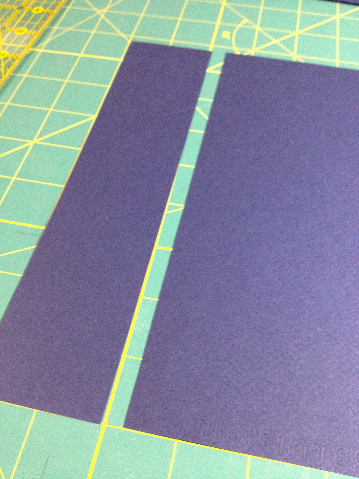
Do you have one of these? I used to be addicted to the Aleene's craft show on TV, but I believe this is the only thing I ever ordered from them. I dusted this baby off and set about making a box from some chipboard and patterned paper. My first attempt was lovely, BUT I had not considered the scarf colours in choosing the paper, so once it was made I realized it would clash. So I made a second box, and then I made a card to go with it.
Doesn't that sound simple?

Ah, but here is where the real work comes in - dreaming up a card that fits the personality of the recipient and coordinates with the box and gift. I tend to avoid cool colours, and modern styles. Hence the dilemma. When I looked at all my stamps and other supplies, I realized that - while I prefer vintage, antique images, and muted autumnal colours - most of the people I make cards for do not!

So I buy stamps and papers to please me - but I am never making things for myself. With my limited craft time, I am making things to please others. Birthday cards, thank you cards, farewell cards - you name it, they almost always are for people who prefer funky images and zippy colours! It becomes a real exercise in creativity when I want to customize a card for someone modern, bright and vivacious!
I started with this bird. I was thinking of retirement as freedom; flight from a cage. I already had the bird die cut from a gessoed old music score sheet. The bird cage was a natural, as well. I pounced it with Dusty Concord Distress Ink, then softened it with an acrylic paint dabber in Pearl.

I backed the cage with more score sheet that I coloured with Mustard Seed Distress Ink. It seems to glow against the purple background. (I think I used the paper upside down - oops!) I used a large rhinestone flourish from my stash. I have a few of these, but I think this is only the second time I have ventured to use them. 
I tied some sheer polka dot ribbon through the cage holes and added some rhinestones in purple and clear. 
I created a couple of mats for these items, one stamped with big blooms in Pearl acrylic paint and Brilliance blue polka dots; the other incorporating some of the paper used on the box. This is the fun of making things yourself - that ability to customize and coordinate; beats a store-bought box hands down!
I topped off the cage with a Grungeboard label that I inked, painted and lettered, and another bit of ribbon. The teeny white brads echo the dots in the ribbon.
Done! Am I alone in my dilemma - buying craft stuff that *I* like, but finding it doesn't help me achieve my goal of making lovingly hand-crafted items for friends and family that reflect them, their personalities and what they would like? Or do you struggle with this, too? Can you understand why, when I am asked "How long does it take you to make a card?" I can legitimately answer "ALL DAY!"

Friday, April 20, 2012

Stampers! Turns 15


My local stamp store, Stampers! Rubberstamps and Papercrafts, recently celebrated its 15th anniversary. This is a great store for supplies and Ann and Steve are very generous in sharing their knowledge of stamping techniques and products. If you ever find yourself in Victoria, BC, Canada on a Saturday afternoon with nothing to do, come in to the store and hang out in the back room, where Steve is usually found giving free demos. I'm often there, so say hi to me and I'll buy you a cup of coffee!

Part of Stampers! success is they often bring in guest teachers from near and far to share their specialty techniques. Over the years I have been able to take workshops and classes with Tim Holtz, the Glitter Gals Haroldine Wingfield and Deanna Pannell, Metal Artist Elitia Hart and others, exploring fun and different techniques. This is what keeps stamping and paper crafts new and fresh for me.


To celebrate the store's 15th anniversary, I created the card below. I took a number of photos to try and capture the sparkle and colours  of the Glitter Ritz Microfine Glitter, but alas, the photos just don't capture them. (Click on the photos to expand them and you will see some sparkle.)


You might be wondering how I got the background, the polka dots and the numerals all done in different colours of glitter, yet all on the same flat layer. I used the Burnished Velvet technique, which is well described in this article. The originators of the technique, Haroldine Wingfield and Deanna Pannell, have a website with tutorials and projects, too. I took Burnished Velvet classes from them at Stampers! I highly recommend you do so if you ever get the chance. In my blog labels on the right you can find more posts about this fun and sparkly technique.

I started by laying a large sheet of Sookwang double-sided tape onto a piece of cardstock.  I peeled the liner away. I carefully laid a piece of punchinella (sequin waste) over this tape base. I die cut the numerals (QuiKutz) from a spare piece of non-stick tape liner and placed them on the taped cardstock over the sequin waste. Then I covered the whole works with the original liner and burnished with a bone folder to ensure the numerals liner and the sequin waste were secured very well.

I lifted off the large piece of tape liner and sprinkled navy Glitter Ritz Microfine Glitter over all the exposed holes. After brushing off the excess, I burnished the glitter into the tape with my finger to secure it and bring up the shine. This step is important. If you don't burnish, there is a fine layer of "dust" on the glitter that obscures the lovely sparkle. This burnishing is what makes the microfine glitter embed into the tape so well that the end result is a smooth velvet feel to the finished product.
Once I had the holes filled with dark blue, I peeled away the "15" liner to expose the holes under it. I placed dark fuchsia glitter on those holes and burnished. My next step was to remove the sequin waste to expose the rest of the tape that surrounded the now-filled dots. Sookwang tape is incredibly strong, so I was delighted to discover years ago that its hold on sequin waste is only temporary! the punchinella is not harmed and can be used over and over.

After I removed the sequin waste, I replaced the tape liner over the "15" to cover the fuchsia holes and the exposed tape of the numerals to protect them. Then I sprinkled various shades of aqua and teal glitter in bands across the card, brushing the excess off each band before adding the next. This gives a subtle ombré look to the background. Once again, I burnished well with my finger.
Lastly, I removed the "15"-shaped tape liner to expose the remaining Sookwang tape. I applied a pale pink colour to glitter up the rest of the digits - and burnished well.

I used the Spellbinders Labels Twenty-One dies to create a navy frame to go around the glittered Burnished Velvet focal point.  I stamped Congratulations (Michael Strong Stamps) on an angle in Fuchsia StaZon ink across the front of the hot pink cardstock, then mounted with Perfect Layers of navy and pink cardstock onto a white card base.

And that's it! It took a lot longer to explain than it did to actually create! This would make a great birthday card - and through careful choice of colours you could make it either masculine or feminine. If you haven't tried this technique yet, check out the tutorials and give it a whirl. If you are in the Victoria area, contact Stampers! I understand the Glitter Gals will be back for more workshops in June. Thanks for visiting - now go get your glitter on!


Wednesday, April 18, 2012

Faux Postage


When you've been stamping 20 years or so, you tend to see a lot of trends come and go. Quite some time ago, faux postage was all the rage. At least one company came out with plastic stencils and rubber stamps to create the "grid" of postage sheets. I recall picking up a couple of these templates at my local stamp store many years ago. What I failed to do, however, was pick up the matching rubber stamps!

Fast forward to 2012, when I am once again in my local stamp store. (Stampers! just celebrated their 15th anniversary in business in Victoria BC Canada. In an industry that's seen so many failures and closures, it sure is nice to see them thriving. I try to do my bit...) Some kind soul had donated a bunch of her old stamps to the store to sell in random discounted lots in aid of a local animal shelter. I spied the Just For Fun diamond-shaped grid stamp that matched my stencil at home and snapped that up. After all, it is my duty to protect poor animals!

After stamping in black Staz-On ink, I masked off the grid with the plastic stencil and then sponged Dried Marigold and Barn Red Distress Inks in the windows. I stamped the French motifs in Ranger Black Archival Ink over top.

This border would make a fabby bookmark!
I stamped the French border and sentiment on white cardstock in Versafine black ink and thermal embossed in clear. I used the same Distress Inks to shade these pieces. I used Versafine Ink in Blue Lagoon to sponge-shade strips of cardstock mats (cut using my Perfect Layers tools) and stamped the chicken wire background in the same ink. This is an easy way to get coordinating cardstock! I used a Spellbinders Ribbon Banner to die cut the sentiment. All stamps (except for the grid and chicken wire) from the same Waltzingmouse set: French Country. The layout of the card is from this week's Waltzingmouse Sketch Challenge. Can you see it?

And speaking of my local stamp store turning 15, here is a little teaser about the card I made for that occasion. I'll reveal all in my next post!


Sunday, March 25, 2012

"Simple" Wedding Album

It's been a looooong time since I have made a book from scratch. I enjoy it, but it takes time, which seems to be at a premium. So I had to fight back panic when asked to make a wedding photo album for my dear friends' daughter. The challenge (besides being a Very Important Piece) was that the bride was in the UK and I am in Canada and her mom is in the US. So soliciting user requirements was problematic. How big should it be? How many pages? Style? Colour? All these things are difficult to determine long distance. Here is what I made:


Finished wedding album, 9 X 13 inches.
Karen wanted a simple, clean album with "Our Wedding" on the front cover. Landscape orientation. Dark blue, with dark blue pages. Silver accents. Originally she hoped to have her wedding party and guests (it was a small affair) sign directly in the book with a silver pen. I advised her to use loose slips of paper instead, so that if someone made a mistake, a page would not be ruined, and giving her the freedom to place their greetings wherever she'd like.


As I had no idea how many pages she would need, I decided on a post-bound album (two posts) with extenders and extra pages that could be removed if needed.
View from top of spine and hinged pages.
The posts are recessed under flaps so when one opens the album, they are not visible, but easy to access. The covers, spines and returns are made from Davey board, covered with navy blue bookcloth. The insides were covered with petal-inclusion handmade paper.


Album opened (inside back cover on right).
A project like this takes a lot of pre-planning. I'll admit I created a mock up from cereal boxes.  I used Canson Mi-teintes paper that I cut down from 19x24 inch sheets for the inside pages. I knew I needed to hinge the covers and the pages so when the pages are turned they would lay flat. This meant the page needed to be cut apart, spaced out and then hinged together again.


Enter self-adhesive black linen hinging tape that I acquired from Quietfire Design. (I also got the four silver colour corner guards from there.)
I needed to get the hinge space accurately and consistently measured before I laid down the tape. I discovered my Perfect Layers Tool was, well, perfect for this task. I wanted all 20 pages to be the same.

Lipped Perfect Layers Tool for spacing.


Removable tape in place.
Removable tape helped keep the paper from shifting.
Hinging tape laid down (both sides).
I made the piece of paper to the left extra wide so I could fold it back on itself before punching the two holes for the posts and inserting into the spine. This is to create extra space between the pages to accommodate the bulk of the photos, notes and mementoes that would be inserted. I also created a pocket page for the last page in the book for any other items (napkins, copy of vows, etc.).


When I made the cover, I created an opening and inserted a piece of pewter that I hand-embossed. The font was the one used for the wedding invitation. I found a free font service and was able to type in the words and have them converted to the font. As my printer is not working (updated my iMac software and lost printer functionality in the process!)
I pulled the title up on my iPad and traced it off the iPad screen with tracing paper! Where there's a will, there's a way!

Pewter insert.
I wanted to include a card that was simple and elegant to match the style of the album. I used Waltzingmouse Stamps to silver emboss the text on a scrap of the same paper used for the inside pages of the album, then die cut the label with a Spellbinders Nestabilities die. I ran around the edge with StazOn Silver Metallic Ink. I dry embossed the Scrollwork frame in my Cuttlebug. 


I used a metallic silver and dark blue layer to frame all with my Perfect Layers Tool.  I wasn't able to present this gift in person, but I have since heard that the happy couple were pleased with the album. Now I can relax!