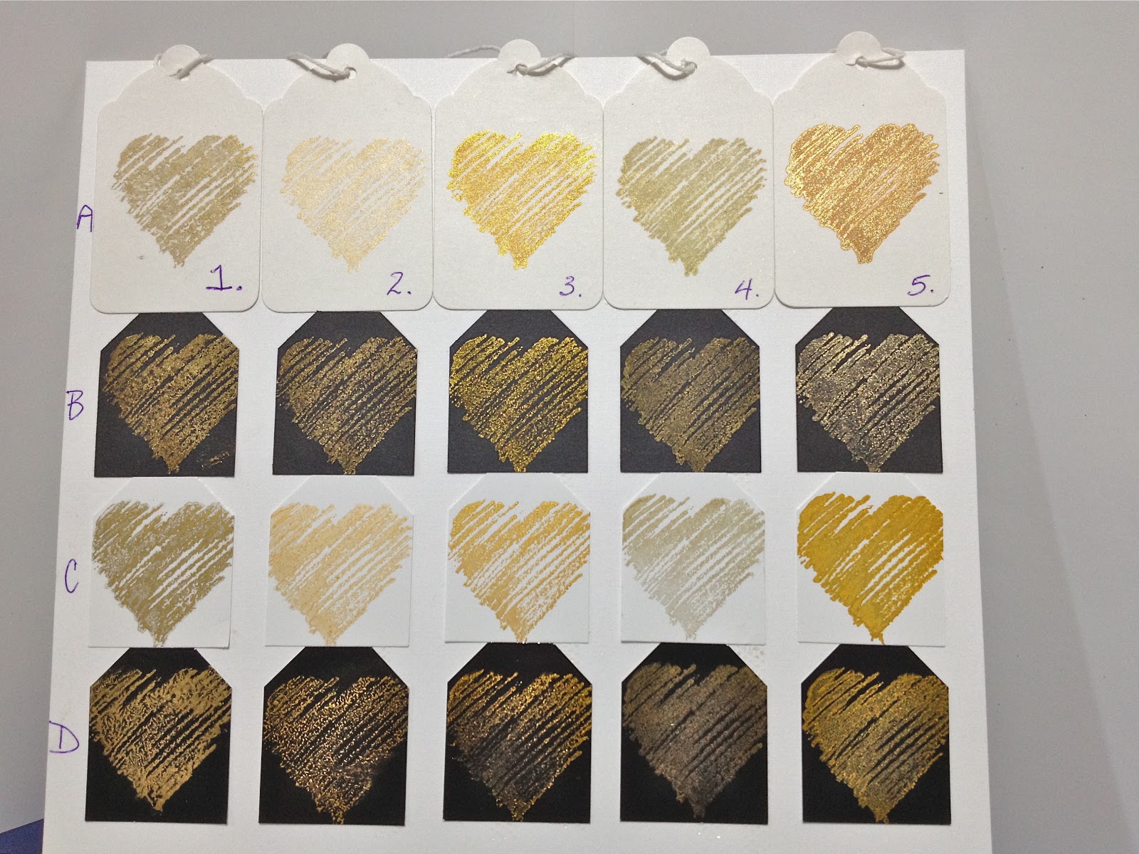
In a recent post, I extolled the virtues of a new stamp pad, Delicata Golden Glitz. Someone wondered how it compares to StazOn Metallic Gold, also made by Tsukineko, so I thought I'd do some side-by-side comparisons. I gathered up all my gold ink pads, reinked any that were dry, and stamped the same Graphistamp Sketched Heart over and over.
 |
| Each column is a type of ink. Each row is a type of cardstock. |
The inks I used are represented by column. Column 1 is Memories Soft Gold; Column 2 is Brilliance Galaxy Gold; Column 3 is Delicata Golden Glitz; Column 4 is Colorbox Gold Pigment (from my Tuscany Petal Point); and Column 5 is StazOn Metallic Gold.
 |
Row A is matte white cardstock.
On matte white cardstock, Delicata (3) is the clear winner for shine, fine detail and a true gold colour. Memories (1) and Colorbox (4) were almost a grey colour. Brilliance (2) was quite pale. StazOn had an odd under-colour of opaque tan brown ink with a shimmery top layer, as though it was separating. Here are some close ups of the StazOn. (It did not do this on the glossy cardstock.)
  |
 |
| Row B is matte black cardstock. |
All of the inks performed well on the black matte cardstock. Delicata (3) placed first for shimmer and crisp definition, followed by StazOn (5), Brilliance (2) and then Memories (1) and Colorbox (4).
 |
| Row C is white glossy cardstock. |
All of the inks dried on white glossy, although I had to heat set the Colorbox Gold (4). I was surprised at how quickly the Delicata (3) dried on the white glossy, as it is not really meant for glossy cardstock use. Delicata (3) won this heat, as well, but I think StazOn (5) finished a close second. The drawback with it is that the thickness of coverage blurs the definition a tad. The yellow is a bit deep, too, whereas the Delicata is a brighter gold. Brilliance (2) came in third, but had a bit of a rough grainy texture. Colorbox was fine except for the need for heat-setting and the greyness, and Memories (1) came in dead last. The ink seemed to bead up and splotch on the white glossy cardstock.
 |
| Row D is black glossy cardstock. |
Last up we have black glossy cardstock. Delicata (3) looked great but refused to dry, even with heat setting, so it's out of the race. The other four dried, but Brilliance (2) is not permanent - it rubs off easily. In this case, StazOn Metallic (5) is the clear winner, with Colorbox (4) a close second. Memories (1) was doing the same weird splotchy thing so it's a very distant third.
 |
| StazOn Metallic Gold on black glossy cardstock. |
I was startled at the almost sage-grey-green tone of the Memories and Colorbox inks, even though I had re-inked both of them prior to use. I wonder if this is the tarnishing that Delicata promises to not fall prey to?
So final tally: in 3 out of 4 paper types, Delicata was the winner. Definitely it is the ink of choice for matte cardstocks. Stick with StazOn for glossy black and test your brand of glossy white to see if Delicata will work as well for you. As I said, I was surprised because this ink is not intended for glossy cardstock. Thanks for reading this far! Hope you found this informative.


13 comments:
Charmaine - this is a super comparison of gold inks. Before I read your post, I'd picked No 3 from the summary picture - just looks amazing on white card! Haven't seen this ink in the UK, but will probably get some when I arrive in the States!!!
Very useful. must look for that new inkpad as it outshines the others.
Carol
Excellent write-up. Thanks for your very clear comparisons and explanations.
Thanks for taking the time to do and analyze the comparison Charmaine. I think I will have to be on the lookout for the Delicata inkpad and reinker.
Thank you for this excellent post and for your time to experiment and post.
Great comparison. Thanks for taking the time to do that. It is very clear for those interested.
Thanks for doing this, Charmaine. Now I'm on the prowl for a Delicata pad and refill.
Great comparison post Charmaine! Thanks for all of the info. I now have to go looking for Delicata inks. :D
Great test for gold inks. Thanks for sharing!
Thank you VERY much for sharing these info!
Found your samples and it answered all of my questions. Thank you so much for doing this!!!
Hi Charmaine,
am I glad I found your blog - thank you for the excellent comparisons. I have been wondering about the Delicata and you've answered my questions.
I see also that I shall regularly visit your blog now that I've found it.
Best wishes, Rose
Thank you for the comparison. I came across this in a search and was really just interested in comparing how the color looked between Brilliance and Delicata. (I have Brilliance already.)
I think personal preference has a lot to do with it (besides performance) because in all the examples I would still prefer Brilliance over the other 3 (w/Delicata the winner) when it comes to the color.
Post a Comment