Sunday, May 30, 2010

Red, Kraft, Cream and Chocolate

I finally had a chance to participate in Tracy's Holiday Challenge and made the requisite five Christmas cards, plus managed a couple of bonus gift card holders, using an interesting colour scheme of red, kraft, cream and chocolate.

Here are the five:

This challenge is great because I bought this Hero Arts stamp on sale at the end of January and I don't have to wait until next December to use it. I stamped the main image on white glossy in Stazon Timber Brown, then warmed up the colour to cream by brayering Antique Linen Distress Ink overtop. Cranberry Memories ink set the text apart.


The bottom border is a Waltzingmouse stamp. I added some bronze glitter to the swirls in the main image, but am not sure they show up (you can always click on any photo to see it larger):


And here are the gift card holders, which I made from a template by Claire Brennan that is available on Splitcoaststampers:

I hope I can play in Tracy's challenge again next month. Wonder what she'll come up with for June?

Wednesday, May 26, 2010

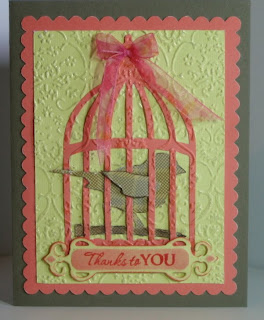
Caged Bird

Tim Holtz has gotten into the die designing business, and this caged bird is one of his new Sizzix steel dies. I had no trouble using it in my Cuttlebug.


I tried something new - I affixed the cage die to a background panel with a few bits of tape and then ran both through the Cuttlebug machine together to emboss. This almost makes the cage look like it is embedded in the background. The embossing continues seamlessly from the cage on to the background (see below). I highlighted the embossed design with glitter pens. The bird was die cut from some recycled packaging from a set of Waltzingmouse Stamps, which included the sentiment stamp (Fancy Phrases). A Spellbinders Fancy Tag die cut holds the sentiment and a bit of stencilling with Distress Inks highlights it. By keeping the inner portion of the cage die unattached, I was able to set the bird inside. Sheer ribbon is the small crowning glory.


I quite like the colours of the various elements I used - the muted coral and yellow-green work well with the little plaid bird. I want to try this again using a light weight paper for the die, like tissue paper or rice paper; I think that would embed even more into the background. I can imagine this with flower die cuts scattered across a background. Thanks for taking a look!

Tuesday, May 25, 2010

Hurrah!

This is a little shabby vintage card celebrating a young woman who is moving out into her own digs for the first time. I antiqued it with distress inks. The house and sentiment are from Waltzingmouse Stamps.


I like how the text peeks out as a border. The papers I used are October Afternoon's Thrift Shop. The Martha Stewart aqua twill tape was in my stash.


The I-top brad maker enabled me to make a coordinating brad center for the flower.


Monday, May 24, 2010

Polka Dot Mojo

Over at The Shabby Tea Room, they are having a tea party. This is my submission, based on their inspiration photo. I am wondering why these dots are called "Polka" dots. I am not sure if there is a connection to that style of dance. Hmmmm.


All the stamps are from Waltzingmouse Stamps. The card is based on this week's Mojo Monday sketch #140.  Here's a closer look at it:

It's hard to tell, but that is metallic gold ink around the rim of the cup. In Real Life it shines. Hmmmm.  The Tea Bag gusseted gift bag (below) is an amazing template that Claire Brennan at Waltzingmouse Stamps has made available free on her blog. If you click on that link, you need to scroll ALLLLLL the way to the end of that really long post to get to the template file. I made a matching tea bag with little tag to round out the set.


Well, all this talk of tea is making me yearn for a cuppa. Thanks for stopping by!

Monday, May 17, 2010

Waltzingmouse Blog Waltz - May

Today is the day! For the May 17, 2010 Friends of Waltzingmouse Stamps Blog Waltz, that is. Our theme is Birthdays, and WMS just celebrated its first birthday, so that's appropriate. Here's my square aperture card:

I was happy to use the Fancy Phrases stamp set that fits so nicely in the Spellbinders Fancy Tags dies. I created the plaid background using stamps from the Pic-Nic Patterns stamp set combined with a long line stamp I found on the Very Vintage Christmas  stamp set. At first it didn't look like much but I just kept adding rows and turning the paper and next thing I knew, I was looking at plaid! The tea cup and pansies came from the Afternoon Tea Sentiments stamp set. I coloured them with Prismacolour pencils and then glaze pens.

Thanks for visiting. If you want to see more from other dance partners in the waltz, please visit Claire's blog for details.

Sunday, May 16, 2010

Distress Inks BLENDING FOAM Storage Solution

I really like Ranger's / Tim Holtz's Distress Inks. I have quite a collection now, and they reside on a Lazy Susan right on my work table. I stack them upside down and I have labeled the sides of the ink pads and grouped them into colour families. I reach for them all the time.


One of the great ways to use these inks is with an Inkssentials Blending Tool and Foam. This is a wood-handled mount with a piece of rough velcro attached to the base. (I staple-gunned the velcro in place so it will never come off.)

A piece of blending foam attaches to this base to pick up and apply ink. I recently acquired a rectangle of foam for each of the ink pad colours I have, but I only own three wood handles. I devised a system to store the foam pads so that I would know which ink colour they are for. I had a plexiglas upright document stand that was gathering dust (remember these from typing class?). I put strips of adhesive velcro (the rough part, like on the base of the blending tools) across the holder in rows, then attached the foam pads and labelled their locations. You can see the stand, and a closeup with the tools sitting on the document holder shelf, below.


I can now peel off the pad I want, use it and put it back. Easy peasey lemon squeezey!

If you are new to these inks, please check out this series of amazing videos on YouTube that Jennifer McGuire did:
Intro 
http://www.youtube.com/watch?v=_zRk1zYwVLw&feature=channel
Week 1 Part 1 Distress Inks 
http://www.youtube.com/watch?v=XjXNnOTAYFA&feature=channel
Week 1 Part 2 Distress Inks 
http://www.youtube.com/watch?v=ZQKR5xHgCJY&feature=channel
Week 1 Part 3 Distress Inks 


Tuesday, May 11, 2010

Two Different Wedding Cards


My friend Mar came for a visit and requested two wedding cards from my studio. I asked her what style: vintage? elegant? country? etc. As I did not know the recipients, she needed to provide some guidance. She decided on elegant for one (above) and country for the other (below). Like most stampers, I like a challenge, but for an elegant wedding card, I was a bit stymied. My selection of overtly wedding-themed stamps is a bit skint, so I went to one of my favourite inspirational cardmaker blogs, Sharon Johnson's No Time To Stamp and browsed for something I could manage. I ended up CASEing her beautiful card here. So thanks, Sharon! Cuttlebug pressure embossing and pearly thermal embossing meet with a Nestabilities layered heart and some sheer ribbon. The word "Love" is the first word in a Stampington & Company Scandal sentiment stamp. It is good to use just part of a stamp sometimes!


I don't have much in the way of "country" style stamps, so when I saw this Memory Box nesting birds stamp in my local stamp store I decided it would work. It's not too country cute, so I think I can get a fair bit of use out of it. I got the pre-printed ribbon at the same store. Just a little watercolouring and some blue Swarovski crystals seemed to be enough. 

Monday, May 3, 2010

MOJO Monday 137

It's another Mojo Monday. Here is the Mojo Monday Sketch 137 that we were challenged with:

Today I am meeting two challenges. Mojo Monday, and also Sylvia's Christmas Card Challenge for May, which was to use a candle. Yes, I am feeling pretty clever! :-)


I used glaze pens and glitter pens on the candle image, but it does not show up in the photo. The candle is a Stamp Barn image and the "Joy" is from Waltzingmouse. Swarovski crystals finish it off.